


Website Layout Design of the Dayang Sumbi Resort
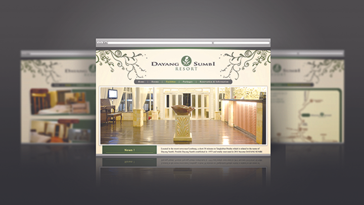
When this project was held, the Dayang Sumbi Resort was already own a website. Regarding of the old website is that the designs were too plain and simply technical. The General Manager then asked if I can make a fresher look for the website. The purpose of the website layout design is because the Dayang Sumbi Resort wanted to raise their online sales through their website by making the website look more appealing, informative, and dependable. The brief for the website layout design is that the clients want it to looked exclusive, clean, informative, but still maintain the local culture elements. From the brief, the visual concept of the website layout itself is: (1) The Graphic. Floral pattern was chosen in terms to show the natural vibe that is offered by the Dayang Sumbi Resort which also far from the urban life, and also to reflect the condition of the natural tourism located nearby. (2) The Color. The use of beige is to show traditional and earthy which represent the old custom that is preserved within the Dayang Sumbi Resort. The use of green is to show and represent natural surroundings around Dayang Sumbi Resort. (3) The Font. I used standard san serif font to give mature look for the website, and also to make all the information easier to read.