


Logo Creation of Bandung Lightsaber Academy
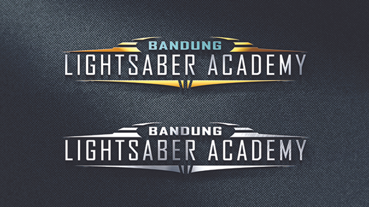
One of the founders of Urban Jedi wants to step up the recruitment and training for new member by making Bandung Lightsaber Academy. The promotion itself is using guerrilla technique from event to event, but the main base is still in the city of Bandung. The purpose of the logo creation is because Bandung Lightsaber Academy wanted and needed to make a consistent visual that is memorable which can be use from time to time on their promotion media. The brief for the logo creation is that the client wants a combining of two elements: (1) the client wants the origin identity of the establishment to show. That is also why the word Bandung is still used on the identity. (2) The client wants the logo to have the identity of a lightsaber. From the brief, the visual concept of the logo itself is: (1) The Shape. It was taken from the shape of the roof of “Gedung Sate” which has been simplified and modified. The oval shape modification is to mimic an umbrella which has a meaning to cope every new member. (2) The Color. Since lightsaber based on the story of galaxies fictional “Star Wars” and Bandung Lightsaber Academy is the first academy in Indonesia, so I used yellow to represent the light of the most dominant and largest in the galaxy, the sun. The color turquoise is to represent the city of Bandung, which historically was a giant lake. The use of silver is to represent Lightsaber Academy as a shining star in the galaxy. (3) The Font. I used lightweight san serif font to adapt the shape of lightsaber and to give modern look. Then I add some reflection to give light effect on the font to make it looked galactic and exclusive.