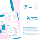
Re-Branding
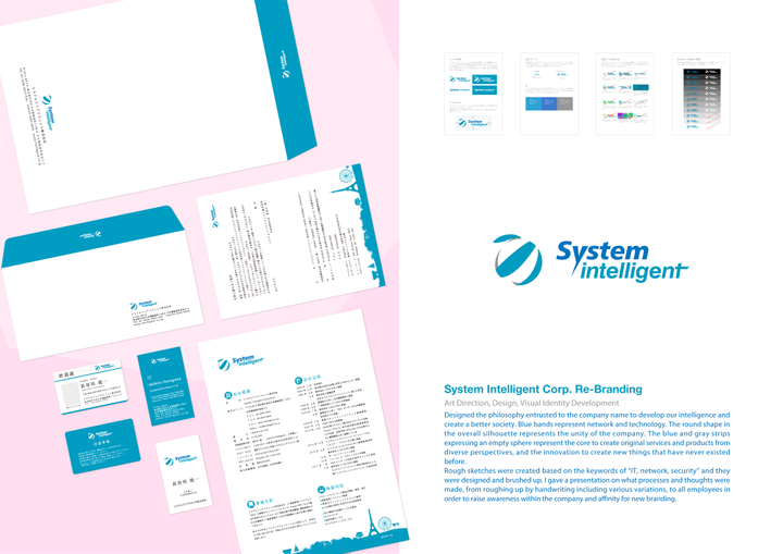
Art Direction, Design, Visual Identity Development Designed the philosophy entrusted to the company name to develop our intelligence and create a better society. Blue bands represent network and technology. The round shape in the overall silhouette represents the unity of the company. The blue and gray strips expressing an empty sphere represent the core to create original services and products from diverse perspectives, and the innovation to create new things that have never existed before. Rough sketches were created based on the keywords of “IT, network, security” and they were designed and brushed up. I gave a presentation on what processes and thoughts were made, from roughing up by handwriting including various variations, to all employees in order to raise awareness within the company and affinity for new branding.