Release of the new job posting cover image uploader and updates to the Content Quality Guideline
Click here to access the German version/hier geht's zur englischen Version
Hi! I’m Yuri from the International Product Development team at Wantedly HQ in Tokyo, Japan.
First and foremost, I want to say thank you for using Wantedly! To assist our clients to effortlessly create job postings that are compliant to our guideline, we've released two new features!
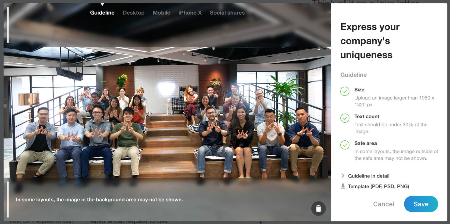
New feature ① Systematic text count
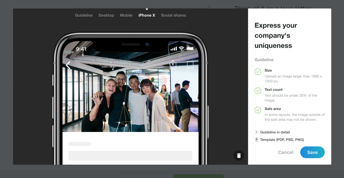
New feature ② Cover image preview
As a result, there’s been some updates to the cover image section of our Content Quality Guideline.
Update ① Change in recommended image size
Update ② Implementation of the safe area
The new cover image guideline will be applied to job postings that are published after January 8, 2019.
Introducing our new features

1. Systematic text count
In this update, the system will automatically check and notify you in real-time whether or not the text in the image is within the 30% limit.
The cover image of the job posting is the companies’ opportunity to showcase the companies’ culture and the amazing people that work at the company.
For this reason, we’ve asked companies to refrain the insertion of text as much as possible.
However, after receiving various requests from recruiting members, we modified the guideline to accept images with less than 30% text. (There are other guidelines regarding this matter)
To reduce the burden on the recruiting members of registered companies, we have implemented a systematic text count in the job posting creation flow. Please note that this is only the primary review and that the Quality Assurance team will continue to measure the text occupancy after the job posting has been published.
We ask for your cooperation in the case the team contacts you after publishing the job posting.
2. Cover image preview
You can see a preview of the cover image in iPhoneX, other mobile devices, and in social shares.
Previously, only the preview of the cover image in the browser was available but now you can see a preview of the cover image in different environments before publishing the job posting.
Updates in our guideline
Change in recommended image size
The recommended aspect ratio and image size of the cover image have been updated to the below.
Recommended aspect ratio: 3:2
Recommended image size (minimum): horizontal 1980px ✕ vertical 1320px
Although it is possible to upload images with differing ratios or images that do not meet the minimum image size, please note that it may not be displayed to your satisfaction.
Implementation of the safe area

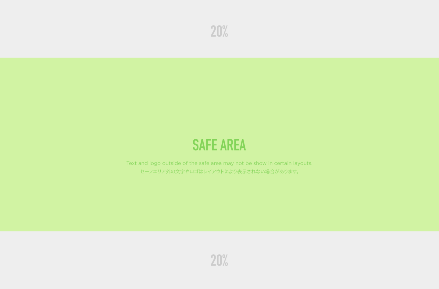
We’ll be introducing two new concepts in the cover image called ‘safe area’, where text can be inserted and ‘background area’, where text should be refrained.
In order to accommodate various devices and shares on varying platforms, we updated the guideline to accentuate areas in the cover image that would be shown in any environment and those that would not. 60% of the central area excluding the top and bottom 20% of the cover image is the ‘safe area’ where text can be inserted.
When inserting text in the cover image, please orient it so it fits in the ‘safe area’. By doing this, you can prevent issues such as the cover image being displayed attractively on Wantedly but in Facebook shares, some of the text is cut off. You can download the guide for the safe area and image size (PSD / PNG / PDF) from here and utilize it when designing your image.
Q&A
Q. When will the new guideline be applied?
A. The guideline will be applied to job postings published after January 8, 2019.
Please be advised that job postings published before this update will be reviewed based on the previous guideline.
In addition, Wantedly has revised the guideline several times before.
Since all the job postings are reviewed according to the guideline when it was published, please understand that there will be job postings that do not comply with the most updated guideline.
Q. How will the job postings that were published before the update be displayed? Do we need to replace it?
A. The job postings that were published before the update will not be affected so there is no need to replace the image.
However, if you update the image after the guideline update, you must upload an image that complies with our most recent guideline. Q. Is the text limit 30% of the safe area or the whole cover image?
A. The 30% upper limit of text is of the whole cover image (safe area + background area).
Also, because this is a systematic text count, depending on the color and design, it may not be read accurately. If the Quality Assurance Team determines that the text count exceeds 30% after the job posting has been published, they will be in contact with you to request you to update the image.
Background of this update
I want to share a bit more about the intention of this development.
With the ratio of mobile app users rising, Wantedly Visit has been rapidly transitioning the starting point of the user experience to the app. Initially, because many functions of the job posting were developed for the web, there was a problem that the size of the images that were designed in accordance with the guideline was too small in the app.
As the vertical resolution of mobile devices increased, this issue became more noticeable. Additionally, due to the new design of the iPhone X, we needed to make appropriate adjustments.

Not only is ‘how the cover image is displayed’ important to the job posting but it is also a key component in expressing the company’s overall image.
Showing images with unintentional cropping was an issue in the design layout and hindered companies from successfully match with talents.
We believed that tackling these issues will allow us to create better user experiences and decided to implement this product update.
Finally…
We hope that this change will assist hiring members in creating even better job postings and as a result will be able to move one step closer in creating a world where work drives passion.
We appreciate your continued support for Wantedly.


